Responsive Web Design: Creating responsive designs for All Devices
In today’s digital-first world, your website is often the first impression customers have of your brand. But here’s the challenge: people aren’t just browsing on desktops anymore. They’re switching between smartphones, tablets, laptops, and even smart TVs. If your website doesn’t adapt seamlessly to these devices, you risk losing visitors before they even explore your content.
That’s where Responsive Web Design (RWD) comes in.
What is Responsive Web Design?
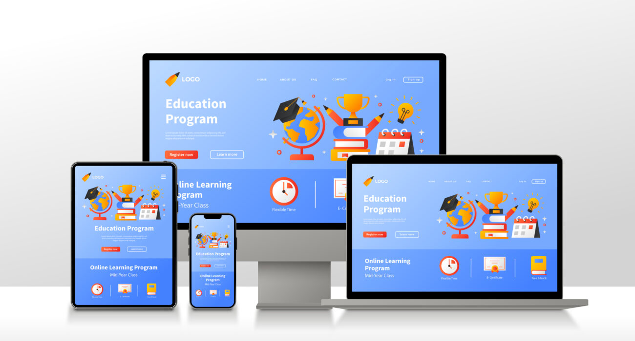
Responsive web design is about creating websites that adjust automatically to fit any screen size, resolution, or device. Whether your audience opens your site on a 6-inch phone or a 27-inch desktop monitor, the experience should remain consistent—clean, easy to navigate, and visually appealing.
Think of it like water: it takes the shape of the container it’s poured into. Similarly, a responsive website flows naturally into the screen it’s displayed on.
Why Responsive Design Matters
Better User Experience
No pinching, zooming, or endless scrolling. Visitors enjoy a smooth, intuitive experience on any device.SEO Benefits
Google loves responsive websites. A single mobile-friendly site is more likely to rank higher in search results than having separate desktop and mobile versions.Cost-Effective
Instead of building multiple websites for different devices, you maintain just one responsive site. Less hassle, less cost.Future-Proof
With new devices coming out every year, responsive design ensures your website is ready for whatever screen comes next.
Key Elements of Responsive Web Design
- Fluid Grid Layouts – content adjusts proportionally, not in rigid pixels.
- Flexible Images & Media – visuals resize without losing quality.
- Media Queries – smart CSS that adapts design depending on the device.
- Mobile-First Approach – design begins with mobile and scales upward.
Real-World Example
Imagine a local Bangalore café that wants to attract more foot traffic. A responsive website ensures customers can easily:
- View the menu on their phone,
- Check location on Google Maps,
- Reserve a table online.
That single convenience can make the difference between a lost lead and a loyal customer.
The Santric Technologies Approach
At Santric Technologies Private Limited, we design websites that don’t just look great but perform across every device. Our team combines creativity with technical precision to craft responsive websites tailored to your brand.
Whether you’re a startup, a growing business, or an established brand in Bangalore, we help ensure your website is:
- Visually engaging
- Easy to navigate
- Optimized for SEO
- Aligned with your brand story
🚀 Ready to Make Your Website Truly Responsive?
Give your visitors the experience they deserve—smooth, consistent, and professional, no matter where they are.
📧 Email us at sales@santrictechnologies.com
🌐 Visit us at www.santrictechnologies.com
📞 Call us at +91-7996382268
Let’s design something that adapts beautifully to every screen.
